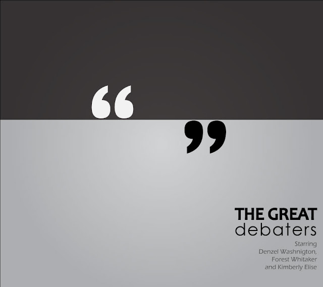
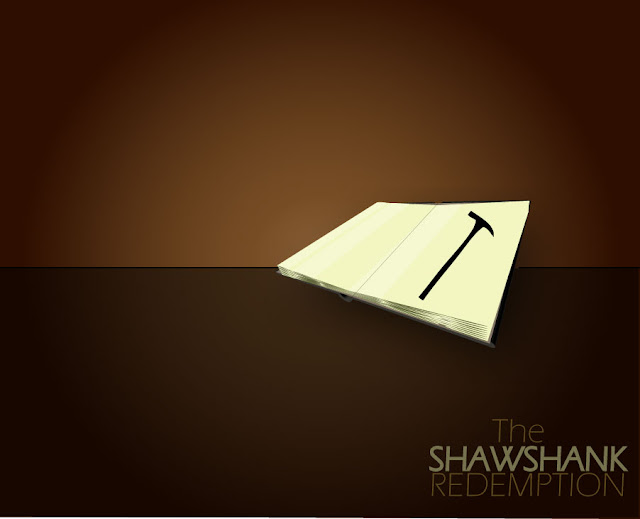
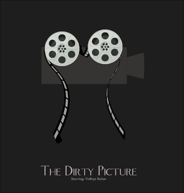
So here they are, in no particular order of relevance except that they're the ones I thought of first. Obviously my design skills need a bit of work (and how!) but overall I'm pretty pleased with how these bad boys turned out. I am already researching ways I can legally MARRY Adobe Illustrator.
 |
| One of my all time favourite oldies (Also one of the very few oldies I've even watched) |
 |
| (I was heavily into Model UN's when I watched this the first time, perhaps that's why it always stuck) |
 |
| Yes, I know the book perspective is totally wrong in this but in my defence, it was my first try and the 'How to draw a book from scratch' Illustrator tutorial only had ONE perspective! |
Well that's all folks! Again, let me know what you think, I'm always looking out for public validation.Oh and if you're hungry for more (and better) minimalist magic, check out the minimalist poster fan page here
Follow us on Facebook:


Greek magic? =D
ReplyDeleteIt's Vidya BTW, not Vidhya! =P
ReplyDeleteDammit! I KNEW I should have checked >.<
ReplyDeleteSomething like that =P
ReplyDeleteI love this post!!!!
ReplyDeletenicely done!! good to see a post here after a month or two.
ReplyDeleteThanks DJ! Glad you liked it!
ReplyDeleteHaha, hey, in my defense it's only ONE month this time =P (Okay, okay a month and a half)
ReplyDeleteAwesome stuff! Really cool concept, less is more and all that jazz. Keep creating :)
ReplyDelete